If you have data to visualize, be sure to use the correct chart. While your data can be visualized within different chart types, it is your job to select the one that provides the best clarity and precision in serving your message. Remember, data is only an asset if you know how to represent it in context.
We'll give you an overview of each chart type and explain how to choose the right chart.
What is the story behind your data?
Before creating a chart, it is important to understand its purpose. Charts, maps, and infographics help people understand complex data, find patterns, identify trends, and tell a story. Think about the message to convey to your audience.
Follow best practices for charting. Your numbers should speak and your graphics should adapt accordingly. What do you want to show? There are four main chart types:
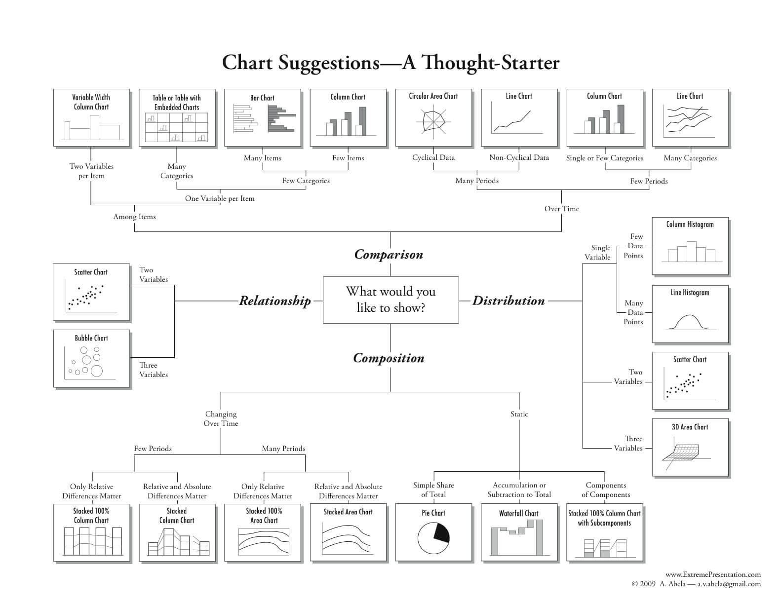
Source : The Extreme Presentation Method
Comparison
Comparison charts are used to compare one or more sets of data or highlight differences over time.
Relationships
Relationship charts show the connection or correlation between two or more variables.
Composition
Composition charts are used to show parts of a whole and change over time.
Distribution
Distribution plots are used to show how variables are distributed over time, to identify outliers and trends.
Select the right chart type
Clarify how many variables you want to show, how many data points you want to show, and how you want to scale your axes.
Line charts, bar charts, and histograms represent changes over time. Pyramid or pie charts represent parts of a whole. As for scatter plots and proportional maps are useful if you have a lot of data to visualize.